bolt.new: Testing Auto-Iteration and Optimization of LLM-Generated Frontend Code Using Its Own Self-Feedback
Quick Context
As a full-stack builder, mostly focused on BE and architecture in my day-to-day, I’ve also been using Claude and v0 to generate React components with Tailwind for a while now. It’s great for the easy stuff, but when it comes to complex customized components, the endless “supervised feedback” cycles start to drag. Time killer.
When this tool popped up a few days ago, I thought, “Why not put LLMs’ self-feedback loops to the test and see if we can kill off those manual feedback cycles entirely?” The goal: boost productivity by letting the LLM handle everything—even the feedback—no humans needed.
The Experiment: Top-Down vs. Bottom-Up
For this experiment, I grabbed a random design from Dribbble (props to Outcrowd for the design) and tested two approaches:
- Top-down: I handed the LLM a screenshot of the full page and asked it to generate everything in one go.
- Bottom-up: I broke the design down into smaller individual components and fed them to the LLM piece by piece. Then, I merged them into a complete page.
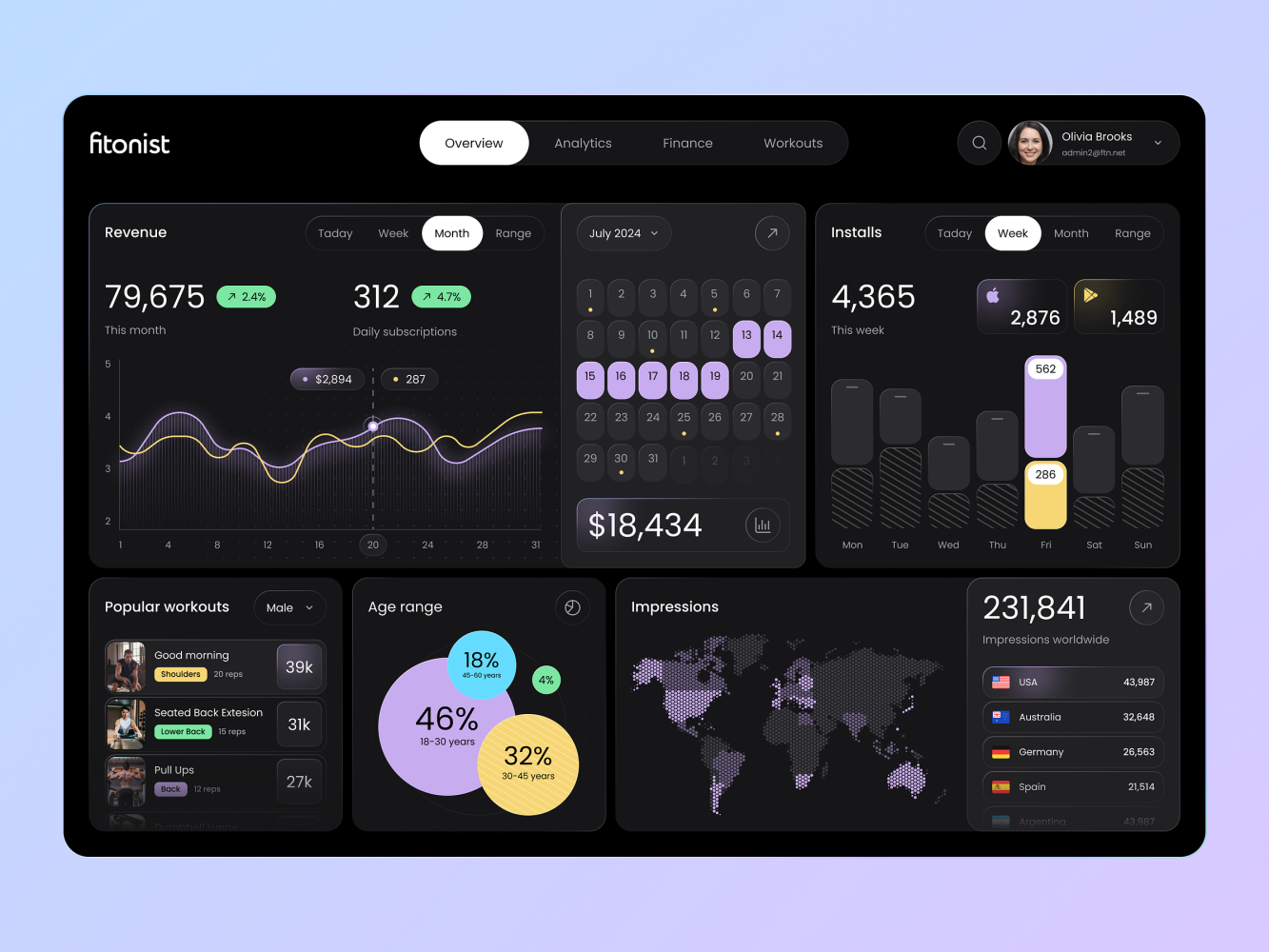
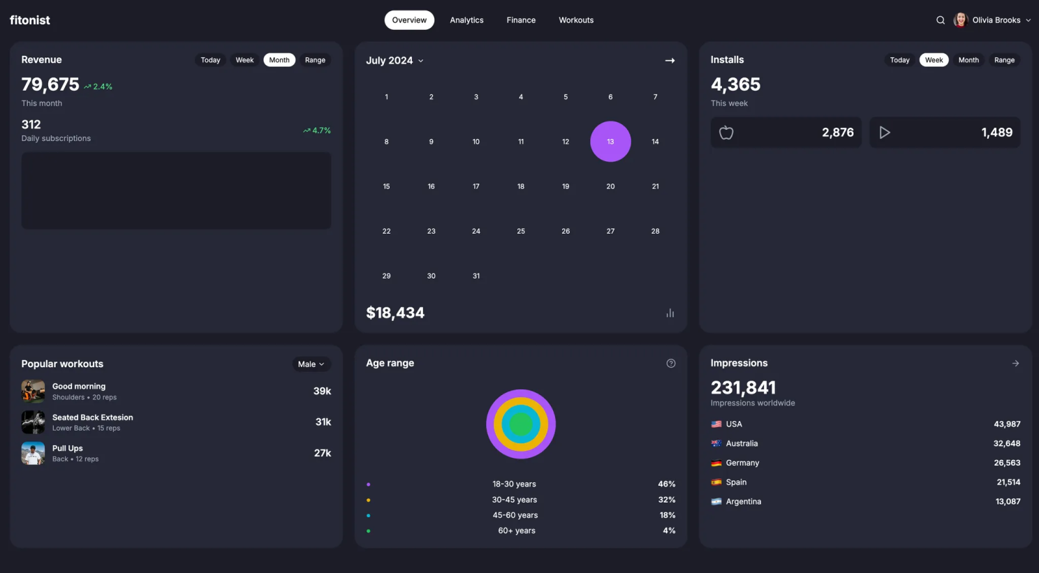
Why this design? It’s got a mix of components and custom styles—perfect for testing the limits of LLM creativity beyond the usual “dashboard builder” task.
Here’s how it went:
I kept prompts consistent for both approaches with the following steps:
- Initial generation
- Self-feedback
- Iteration
- Acceptance threshold
The initial prompt was kept super simple—no extra instructions.
The self-feedback prompt picked out the visual differences and gave detailed instructions for improvement. The LLM iterated based on its own feedback until it hit the pre-set threshold for acceptable differences.
No human feedback was involved—just a few pre-set prompts doing all the heavy lifting.
Top-Down Approach: Quick but Limited
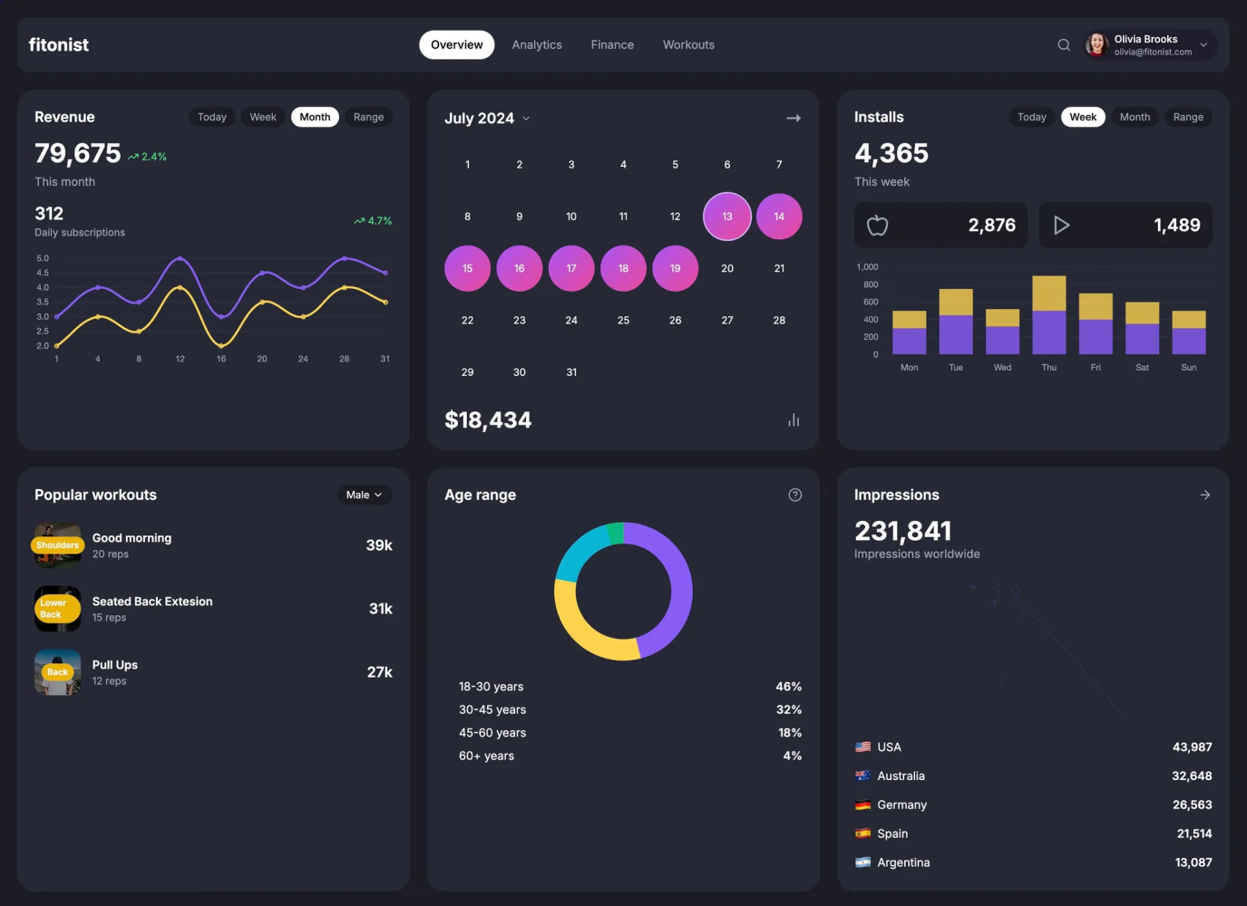
The first generation was okay, but as expected, a lot of fine details were off. The visual representation wasn't quite right for the custom components.

After the first round of self-feedback, there were small improvements. However, by the second or third iteration, the changes became negligible. It seemed the LLM had reached its limit in terms of improvement, and the design wasn’t getting much better.
Conclusion
The top-down approach hit diminishing returns pretty quickly. It became clear that tackling a page holistically wasn’t going to cut it for more complex, custom components. Time to pivot to the bottom-up approach.
Bottom-Up Approach: Fine-Tuned Precision
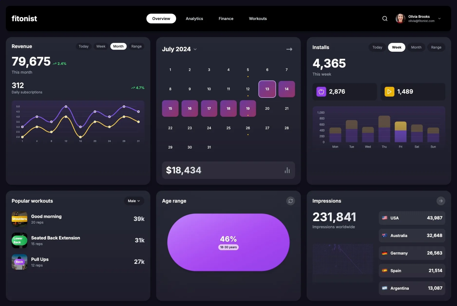
Breaking the design into smaller chunks helped significantly. Fun fact: the LLM thought the new version of the Age Range component was closer to the original design, even though it looked a bit off. Honestly, I can see the logic—it does make sense from a visualization perspective. 😂
Final Result
The auto-iteration process had pretty much wrapped up based on the predefined prompts. I jumped in with just a tiny bit of manual tweaking to fine-tune things and get it closer to the original design.
(Sure, I could’ve gone through all the nitty-gritty—colors, shading, gradients, you name it—to get it as perfect as possible. But you get the idea.)
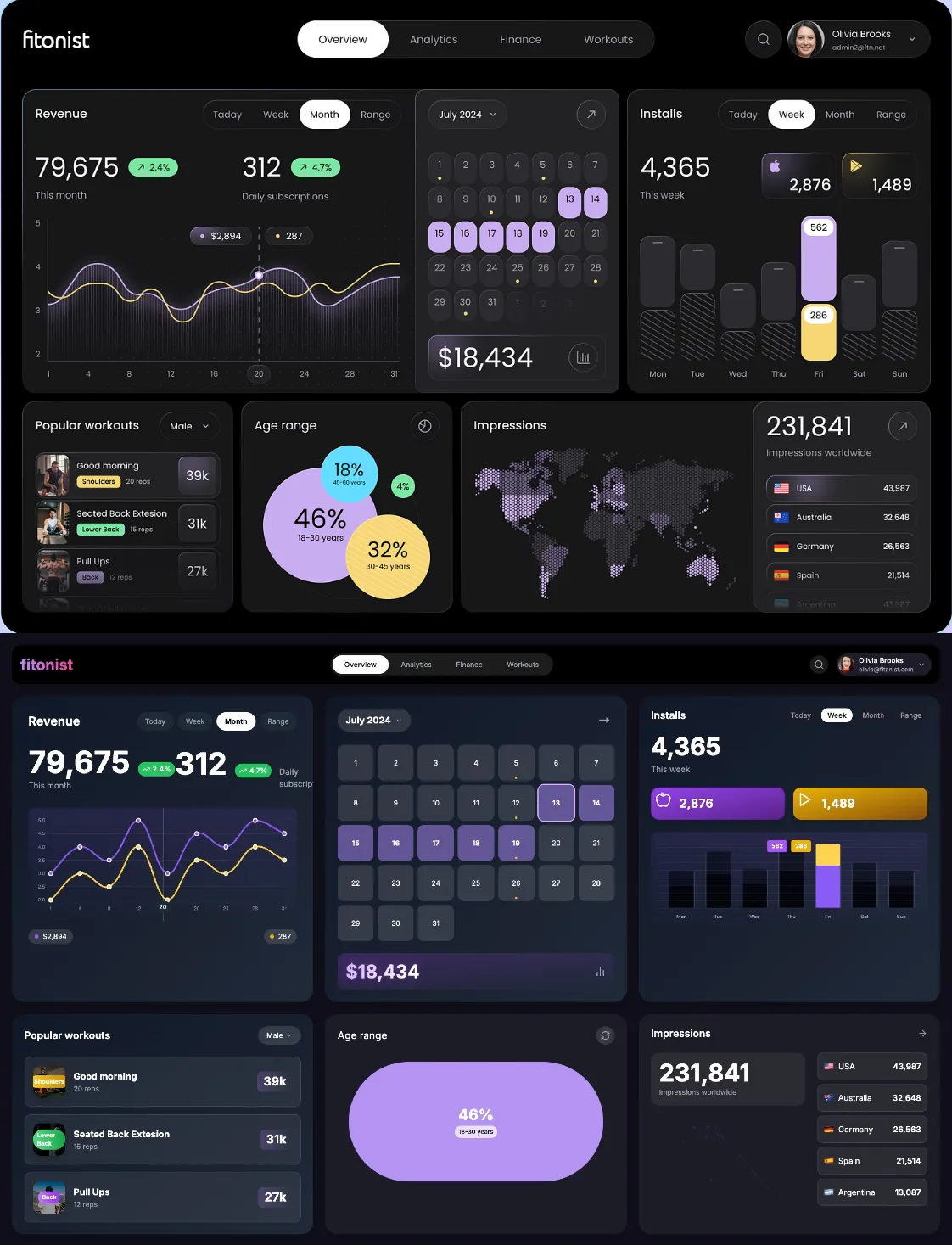
And here’s what it looked like right after the initial generation, just for comparison:
Key Takeaways
- Standardized Components Shine: LLMs are great with familiar components, particularly those they've been trained on. When it comes to heavily customized designs, though, they struggle.
- Diminishing Returns After a Few Iterations: Self-feedback works well initially, but beyond a few cycles, the improvements plateau.
- Granular Prompts Yield Better Results: For maximum gains, provide detailed prompts at the component level. Don’t rely on holistic generation for complex designs.
- Self-Feedback is a Game-Changer: While LLMs may still need a bit of human intervention for highly custom work, the concept of RL and auto-optimization could revolutionize frontend development. Auto-iteration saves time and lets you focus on more important things.
Final Thoughts
This experiment was a fun way to explore LLMs and self-feedback loops in real-world frontend scenarios. If this is the future of development, we're looking at a more automated, time-efficient process. Manual prompt engineering will continue to play a role, but we’re getting smarter about how we approach it.
Keep an eye on RL with auto-optimization—it could be the next big wave. And as they say, "What gets measured, gets improved." ✨